I Like to Waste My Time: evolution.
Yuriy Sklyar
In this article I'll briefly talk about the process of creation of one of our internal projects, I Like to Waste My Time.com (est. March 18, 2011), and some of the design and marketing techniques we've been using to get the website up to 800k+ monthly pageviews.
I'll also discuss some of the future updates, and how we're planning on monetizing the website without the use of a single third-party ad, which seems to be what most of our competitors are doing.
Looking to design a community? Get in touch.
Competition
Before I get started, I thought that it would be a good idea to mention some of our competition.
The market of all things “interesting” is extremely saturated. By the looks of it, the main concern of the owners of these websites is to make money, and the only way these are monetized is through the use of ads. On average, you can expect to see 3-4 graphical ads, plus many more text-based advertisements throughout these sites on a single page .
Twisted Sifter was one of the more popular of the bunch, with an Alexa rank of 14,767 (ours was sitting at 160,306, out of 366,848,493 active websites in the world; we eventually broke freethe 50k barrier at one point). I know that it doesn't mean much, but we've come to a conclusion that Alexa does a pretty accurate evaluation of how “important” a website is.
.jpg)
Humble beginnings of ILTWMT
.jpg)
.jpg)

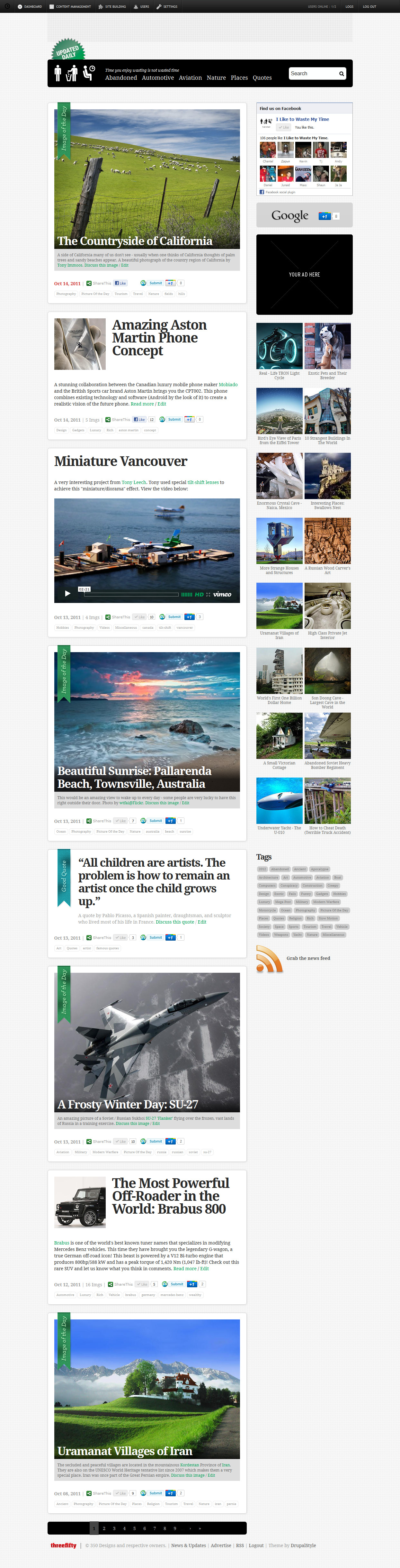
ILTWMT v1.5

.jpg)
.jpg)
.jpg)
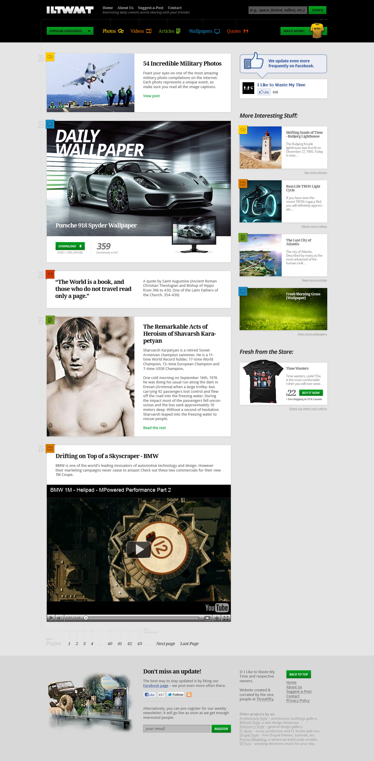
ILTWMT v2
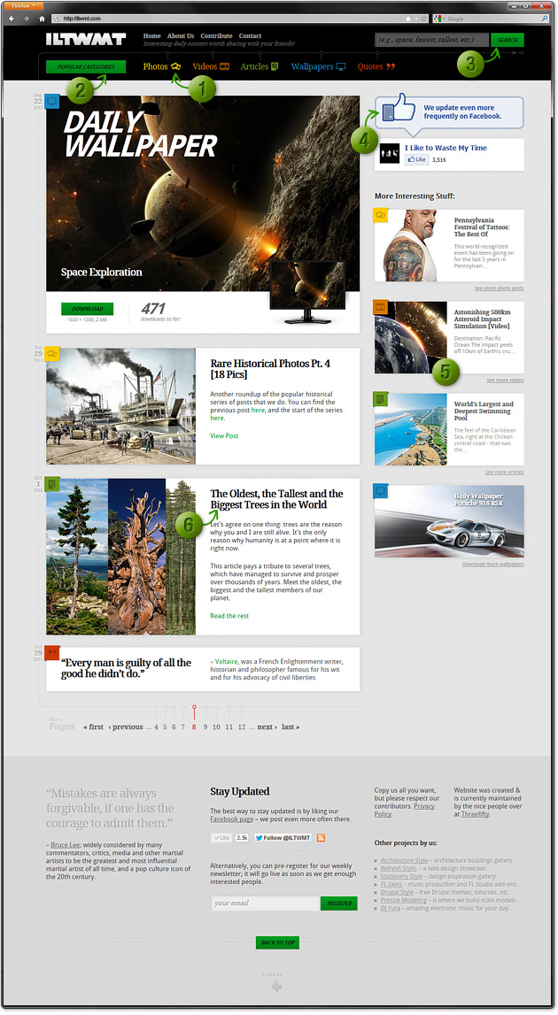
1. Organization. Consistency. Usability.
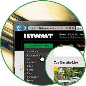
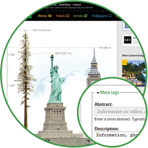
ILTWMT contains over 1,000 posts (with new ones being added on daily basis) that consist of articles, videos, wallpapers, quotes and photo compilations, so keeping all of these organized was an essential part of the usability experience. Each category is represented by a distinct icon/color combination, making them easily recognizable.
2. Content Discovery
We divided all the content into several categories – this way users can narrow down to what they're interested in right away. If screen resolution permits, the header will stick to the top of the screen giving them access to navigation on long, content-heavy pages. At the end of each post we can manually select suggested content for further reading, creating a very targeted referral that works out great for multi-part posts.
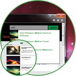
3. Comprehensive Search
Another way to discover specific content is through the search bar which, depending on user's screen resolution, will also stay visible at all times without having to scroll to it. Similar to Google's instant search, only 3 characters are enough for the search field to start displaying results – this eliminates quite a bit of clicking around. We're always improving search algorithms to make the search results more meaningful.
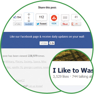
4. Social Networking
We take our time to promote each post on several social networks, and we don't run any campaigns where we capitalize word “LIKE” all the time. Just as the website itself, all of our social media is growing organically; this is a slower process, however quality of engagement is evident and numbers speak for themselves. People simply like us because we put out interesting content.
5. Choice Paralysis
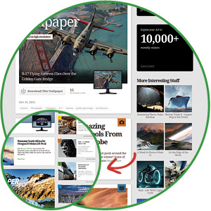
Choice paralysis occurs when a user is given too many choices; unable to decide, they simply abandon whatever it is that they were doing. To test this theory, previous designs were stuffed with suggested posts and ads... Needless to say, we're glad that those times are over. Current design suggests only 4 different content types, all based on keywords found on that particular page.
6. Copywriting + SEO
We strive to deliver unique, quality content. We do all the research, copywriting and any other content generation such as photography and illustration on our own (where applicable). Quality content isn't very useful if it cannot be found, so a great amount of time also goes into determining what keyphrases people are searching for. Up until a recent spike in referral traffic, our organic SEO was driving close to 50% of all the visits to the website.
Identity refresh
![]()
Threefifty Blog.
Thoughts on design, marketing, content, consumers people, and life – from Threefifty team. Share. Subscribe.