Best websites of real estate developers
Yuriy Sklyar
While doing research for an upcoming real estate development project I had to review close to 100 development related websites. The reason why I say development related is because the market is so saturated with poor, low quality property developer websites, that I had to consider some construction company websites, real estate management websites, and even just general real estate listing sites – it's quite sad…
Good news though if you're a developer, or are in the business of real estate!
Search engine competition rates are either low or medium – never high – both globally and Canada-wide; and if you are serious about your business and are willing to invest in your brand, you can fairly easily set yourself apart from 99% of your competition. Let this article be the testament to that.
Overview
While planning the website I was mostly focusing on usability and graphical presentation. Since selling a highrise is first of all done through the visual means – similar to how people judge the book by it's cover, or judge a person by his or her looks – I've settled on the fact that the website is going to take up the entire real estate of users' screens; which will enable our client to highlight any previous or upcoming projects from their portfolio right on the main page of the website in a very visually appealing way.
Most of the companies that use this particular technique do it either through the use of Flash – which is no longer accepted and should never be done (a lot of devices do not support Flash) – or with the help of JavaScript, which is what we will utilize.
What will set apart our client apart from their competition is the quality . Besides many other things that can be done to ensure the consistency in quality throughout the website, we will make sure that the hosting infrastructure is able to support and deliver extremely fast download times, which in the end will enable us to use bigger, more high resolution files to display – something that even the winning website of this post doesn't do.
The Showcase
To sum things up, out of all the websites researched here's a handful of the more or less deserving ones, and a brief comment for each one:
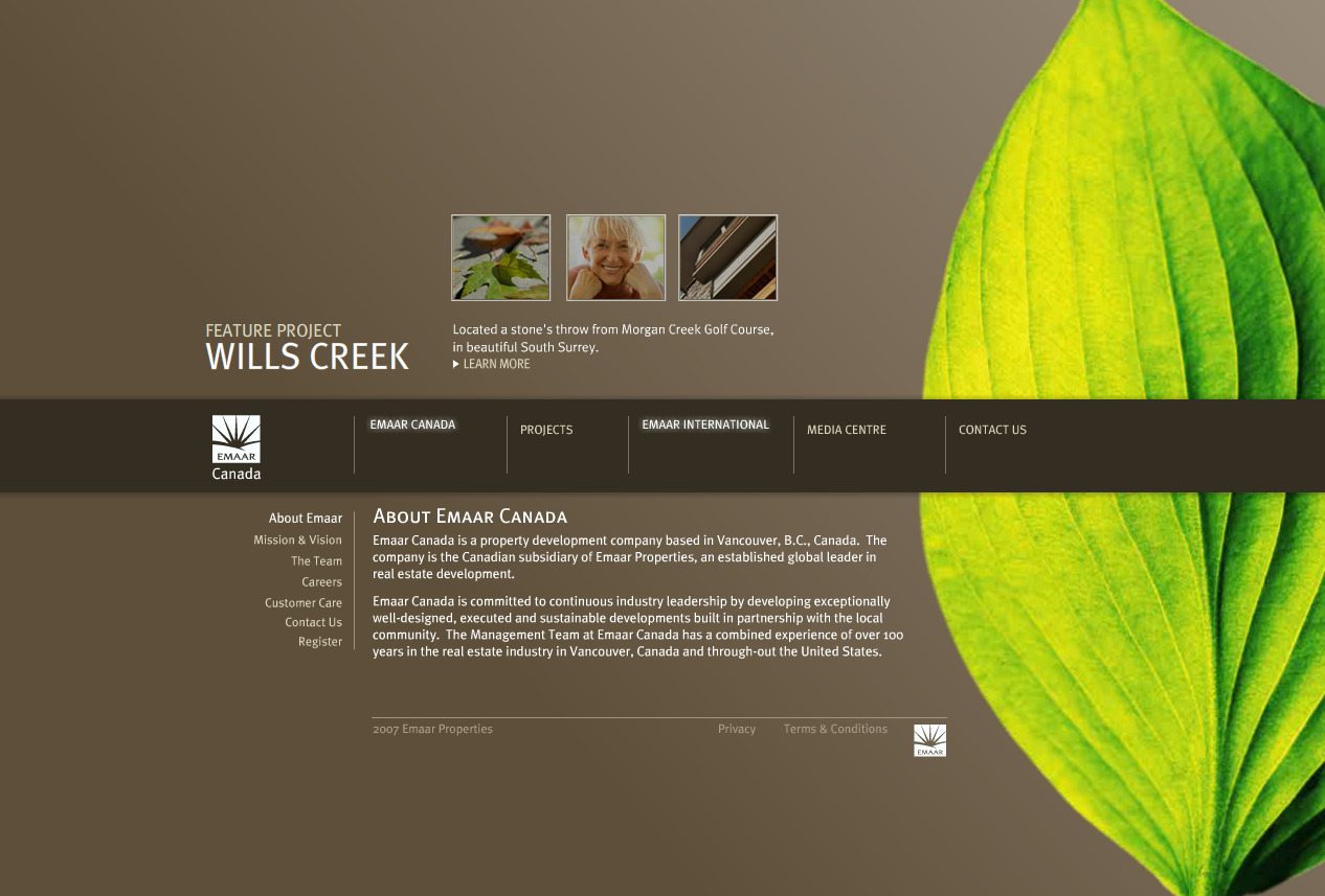
Emaar features a unique design, which you will soon be able to tell sets it apart from the other websites. The main drawback in this case is that the entire website is built using Flash, which is just a complete misuse of technology that's hurting the company in many ways they apparently don't know about.
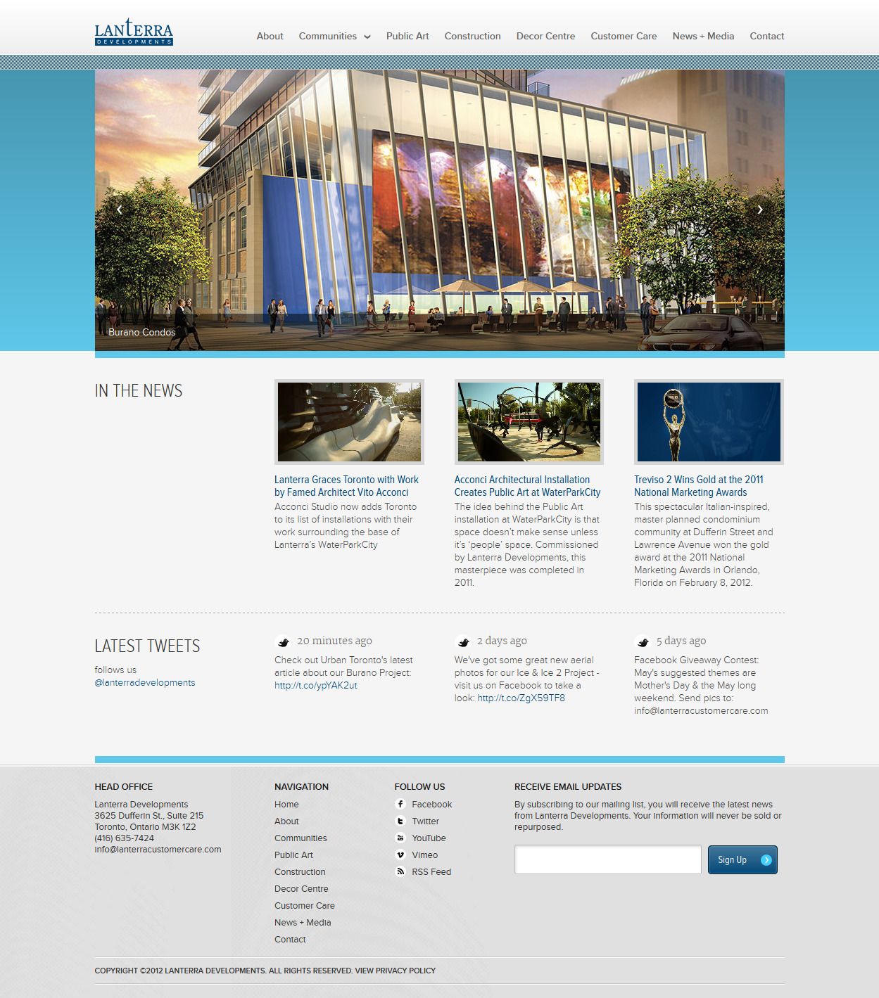
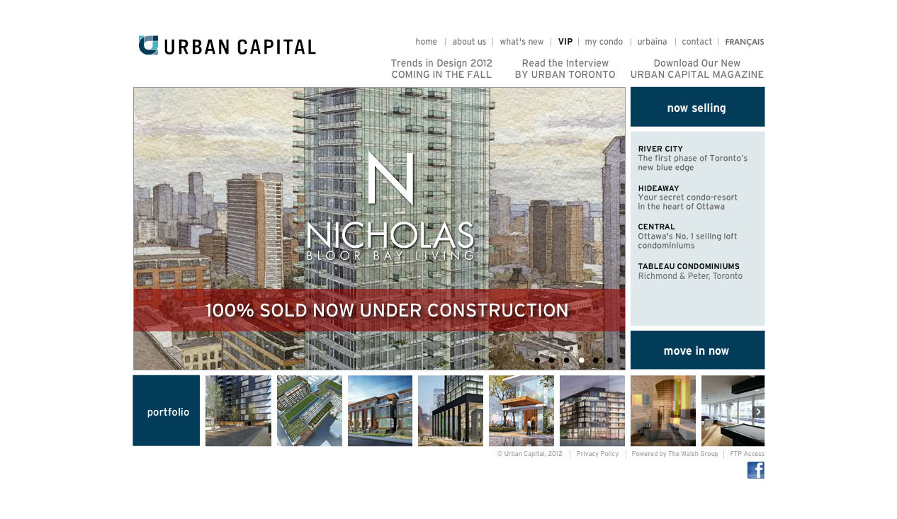
Although Lanterra's website lacks in creativity department (most of the websites follow a similar layout), it's still one of the more usable of the bunch. Can you have a creative and usable website? You most certainly can...
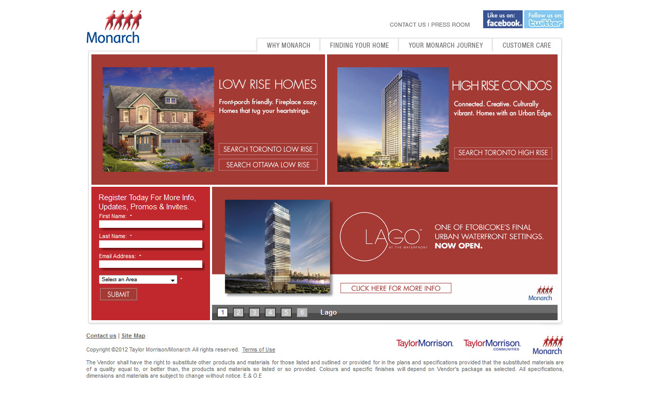
Monarch Group – one of Canada's largest and oldest development companies, has a website older than the internet itself; it's still using extremely outdated technologies (tables, images to replace text, poor code, etc) and is in dire need of a new update.
Considering that Freed Developments puts out extremely beautiful work (just check out their portfolio), you would not be able to say the same thing about their website. Yes it's usable; yes they are on the right track in terms of SEO and social media, but in my opinion, the quality of their work does not match that of their website.

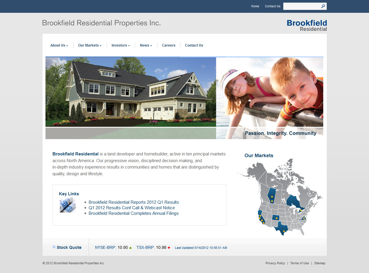
It seems that the bigger the company is, the less they care about their website – or does it have something to do with burecracy? Either way, the website is using old technologies and has not been updated for at least 3-4 years.
I said it before and I will say it again: Flash is a dying technology, and in this case it's also a big misuse.
Overall, Polygon's website is good. My only concern is with how all the content is laid out. There's a much better way to do it while trimming the excess info that people do not need to see... at least on the main page of the website. Also, why do people think that it's a good idea to use absolutely random, in most cases, stock photography of absolutely nothing . Leave the photos of happy smiling people for the window prints of small drug stores.

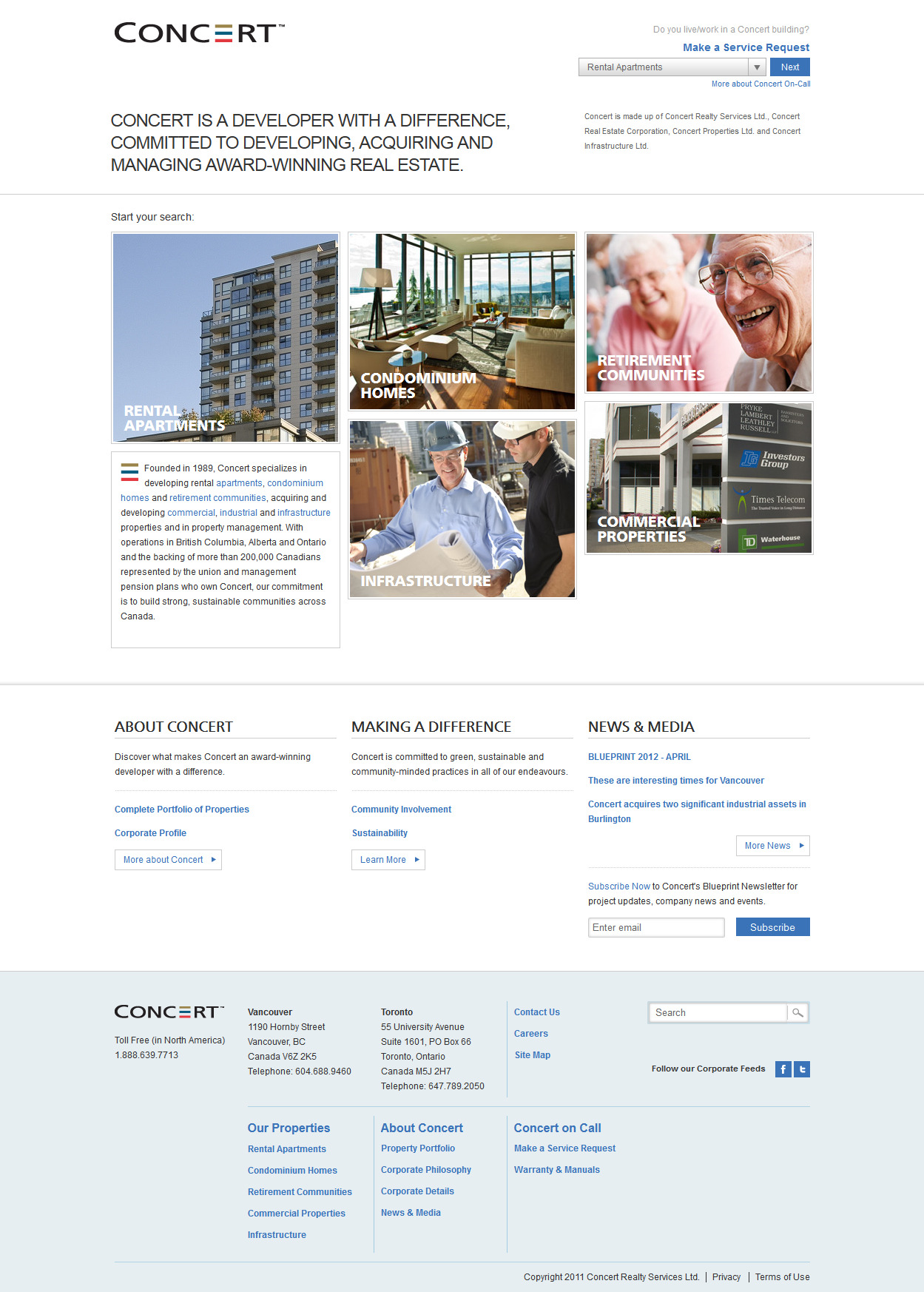
CONCERT's website is extremly complicated to use – I wouldn't be surprised if they have poor conversion and bounce rates. Also, they do not follow one of the most basic rules, any junior web designer knows: you should never change the layout/navigation so drastically on your website. Try it out for yourself, and see what you think.
Again, this is a case of playing it safe – I don't know anyone who played it safe and who's name will be remembered. I feel that similar to how architects are pushing the boundaries of what's possible, marketing companies (web shops, etc) should also be heading the same direction. You guys spend so much money on ensuring that your buildings look nice, yet your website looks just as good as most of the templates online... really?

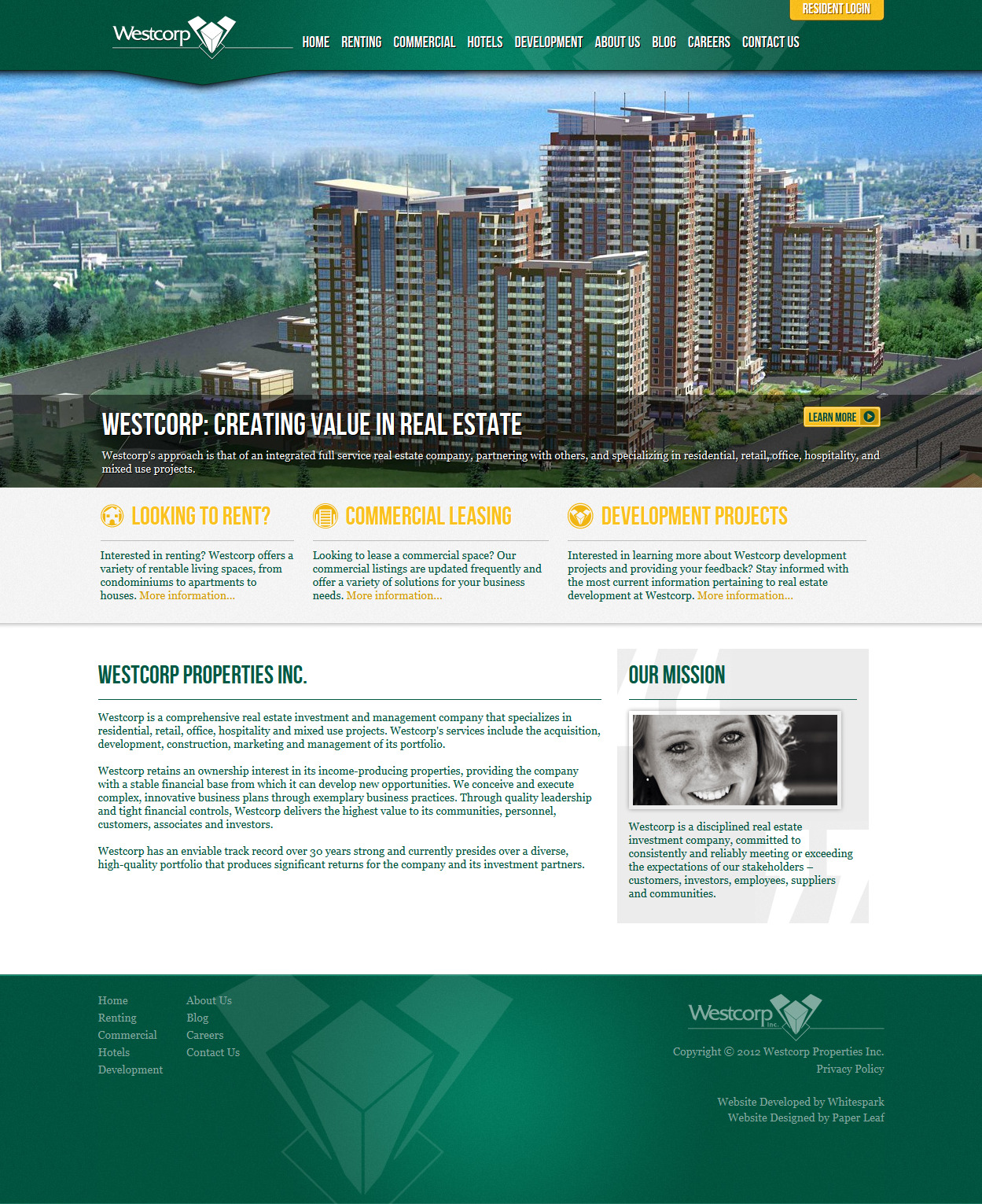
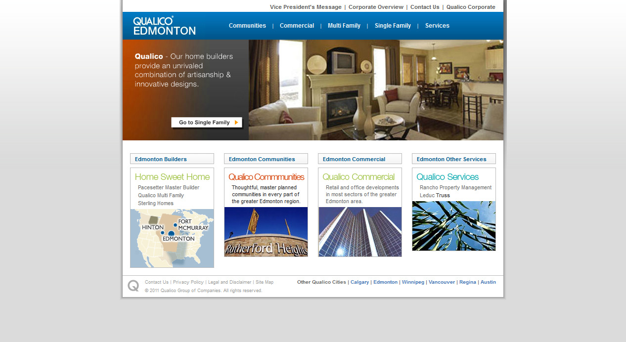
As far as I know, this is the only best developer website to come out of Edmonton at this point. Though it won't win any awards, at the end of the day it's pretty good in terms of usability. My advice to the owners would be to cut down on copy and get more graphical.
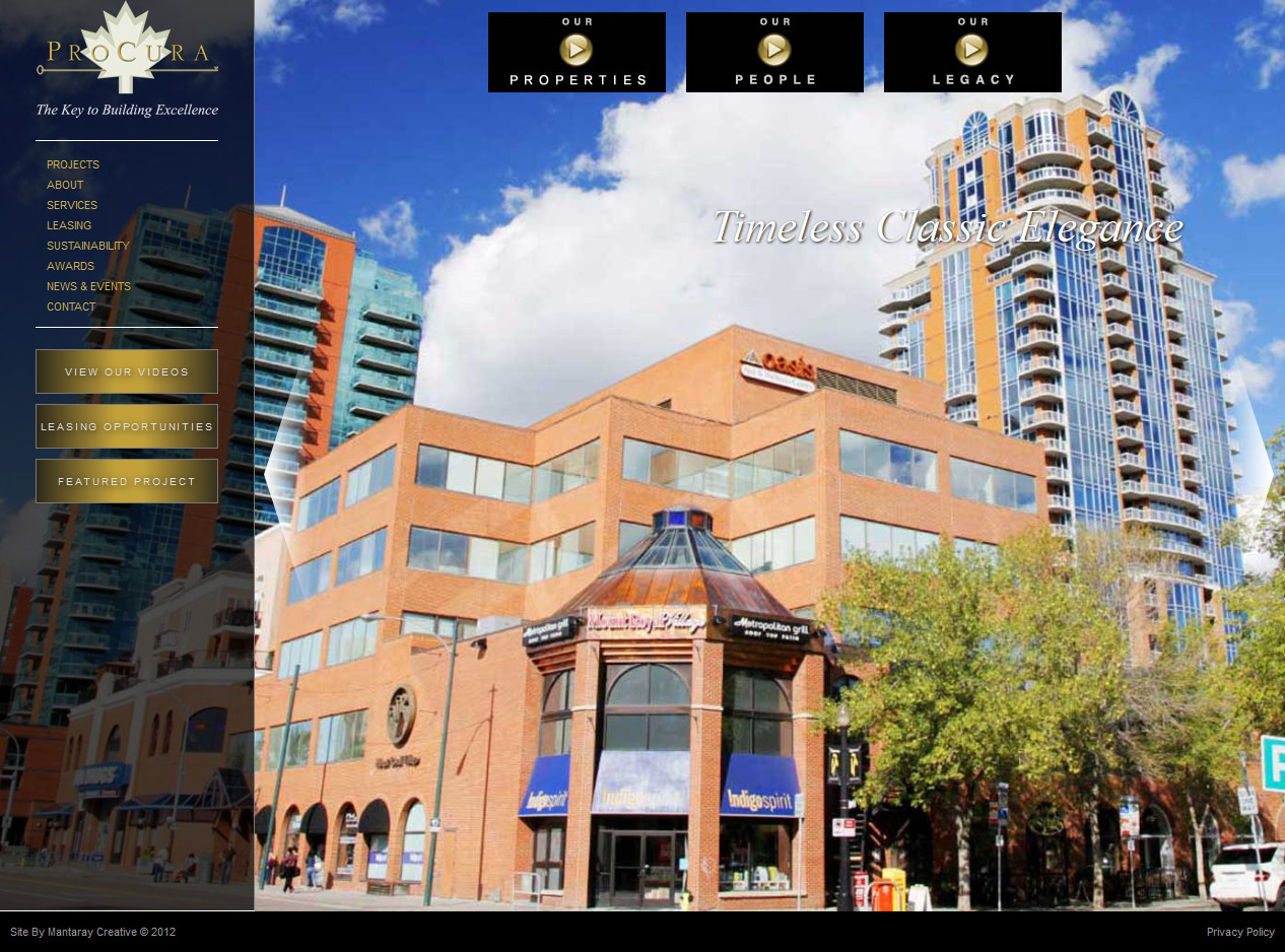
The idea behind this website is pretty solid, however similar to most of their portfolio (though I did like 2 of their redevelopments so far), the creativity, the quality and the execution is extremely poor – a lot of room for improvement, to say the least.
Nice, clean website, right? No! As soon as you browse off of the main page, you realize how extremely bland and boring this website is. No one cares to read short novels online, when they are searching for information, which is exactly what this website is making you do. Why all of their communities are listed as text links inside of their 2nd or 3rd paragraphs, is also beyond me.
Perfect example of how not to build a website, thought it's still a lot better than most of the ones that didn't get listed here.
And the winner is...
I'm sure that if you've actually read through this entire post, and have taken a second or two to check out each one of the websites listed here, you're probably extremely bored – I know I was when I did the research. Keep in mind, I've picked out the best ones out of many that I've encountered...
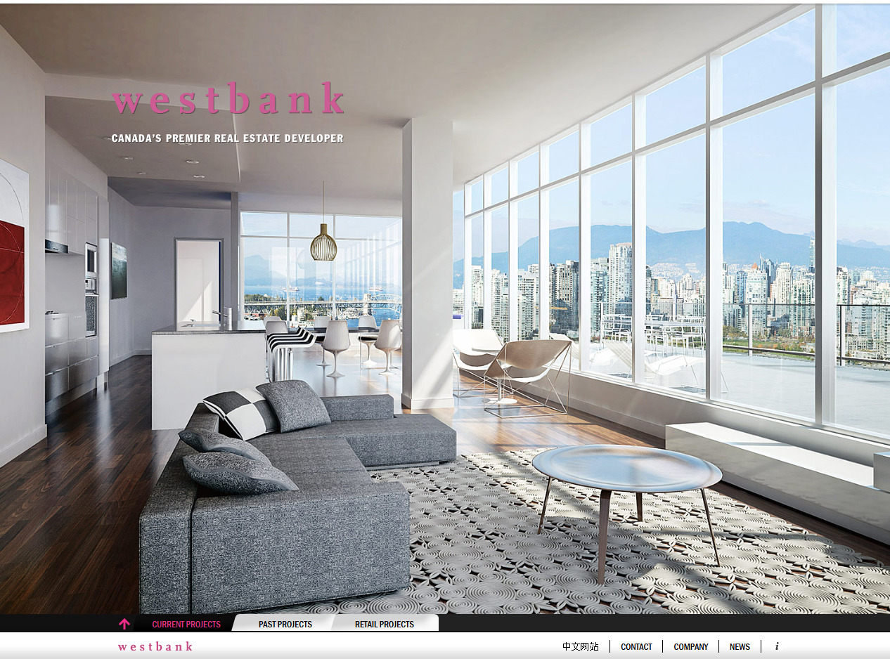
Now, to turn things around and show you that there still is some hope left in this world, take a look at Westbanks' website. It's by no means perfect, but compared to most, if not all of the above websites, it simply is a pleasant and refreshing experience to interact with – a near “perfect” bland of technologies and efforts. See for yourself.
If I missed a website that you think deserves to be in this list, let me know in the comments below – I'd love to see some more nice real estate websites.